Covid-19
Portfolio Project
In this project, I honed my skills of Data Exploration and Data Visualization in order to organize and transform raw Covid-19 data using MySQL so that I could later create a simple but effective Tableau Dashboard that helps to tell the story of the world's most recent global pandemic.

Obtaining & Exploring My Data
The first step I took in this project was obtaining my data. For this project, I used publicly available data regarding the number of Covid-19 cases, deaths, hospitalizations, and tests from every country around the world. The data I used was provided by the numerous researchers and contributers at Our World In Data, and can be found here. After downloading this raw data with 67 columns and over 200,000 rows, I decided to break the data up into two datasets, one focusing on information regarding Covid Deaths and the other with information on Covid Vaccination data. My next step was to import the data into MySQL and start exploring!
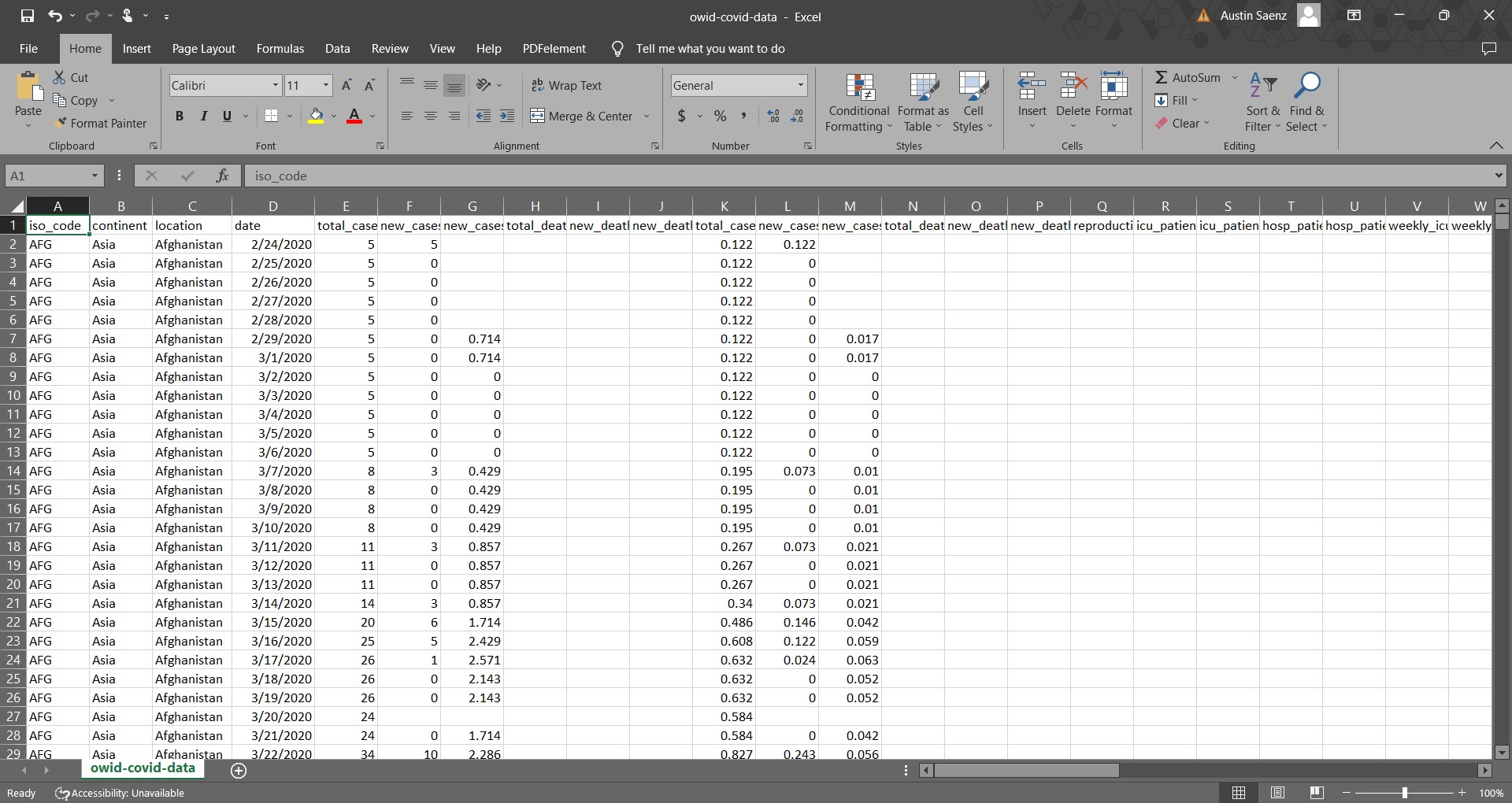
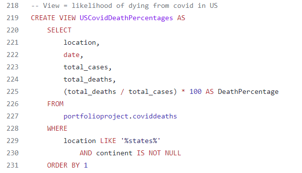
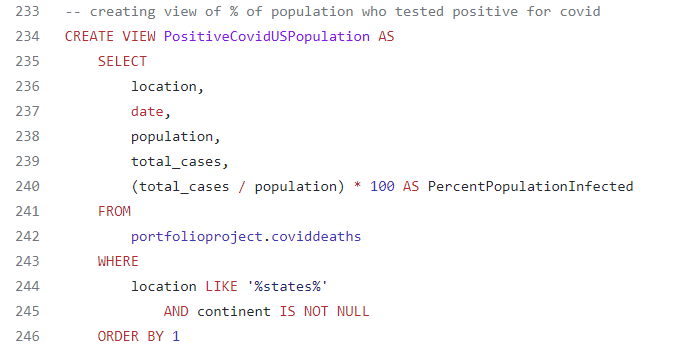
After successfully importing my data into MySQL, I knew that there was a lot of raw data within my dataset that would not become important in my analysis. To help filter and sort my data, I only focused on analyzing the location, date, total and new cases, total deaths, and population. After doing so, I grew more curious on the impact of Covid-19 in the United States, and ran the first few queries focusing on the death percentage and the percent of the U.S. population that had been infected by Covid.
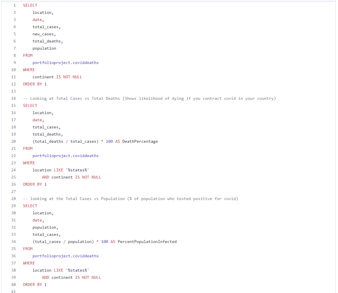
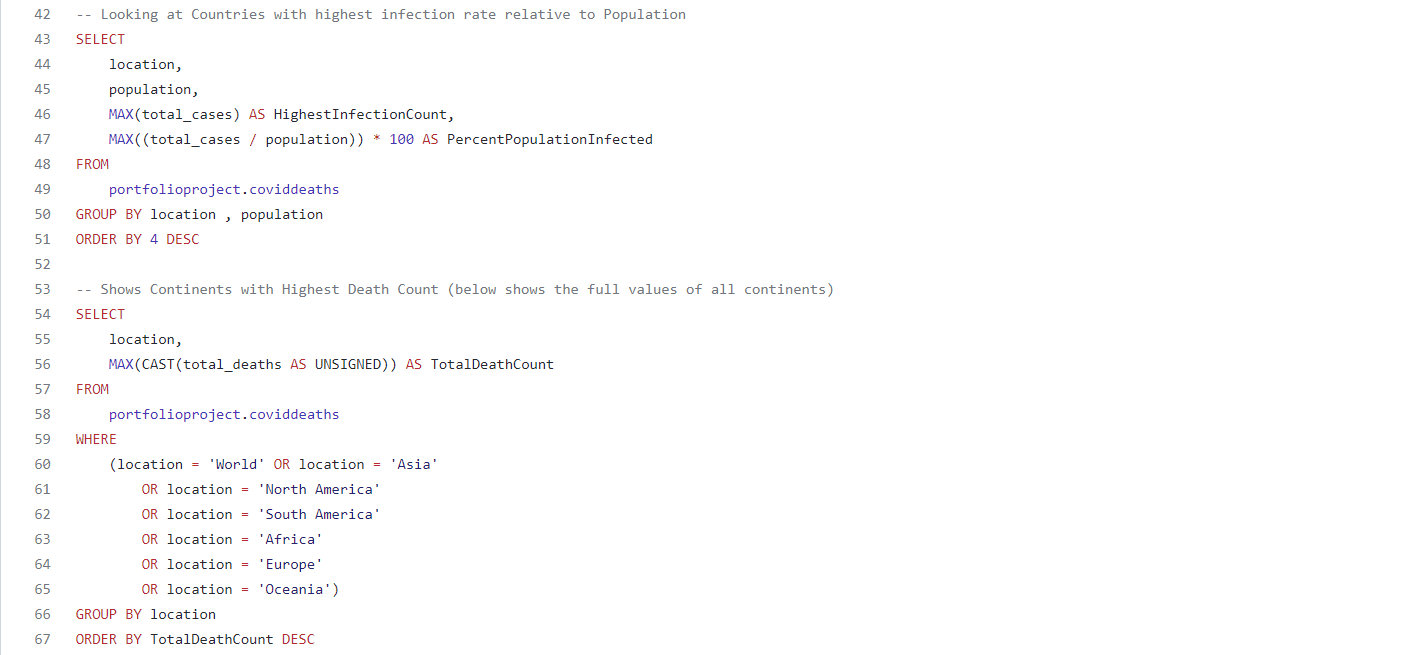
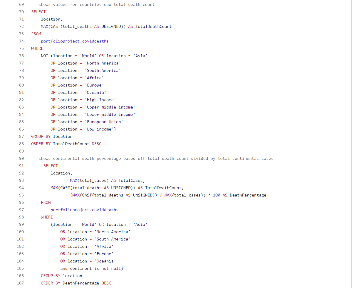
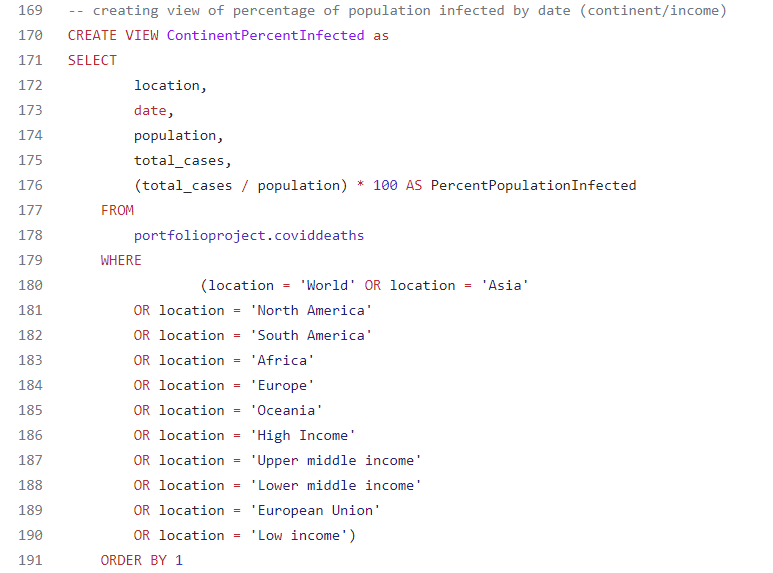
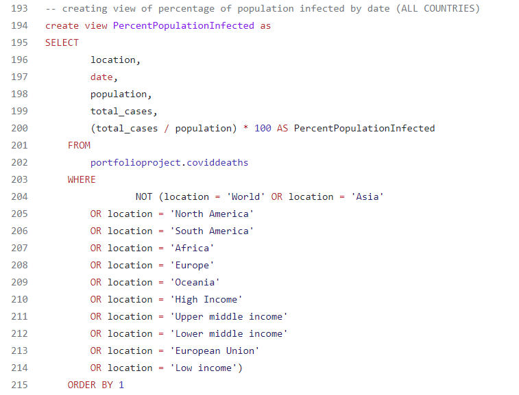
Expanding on my curiosity with the United States, I wanted to look at other countries and continents around the world, and compare them to my findings for the U.S. In doing so, I ran the following queries:
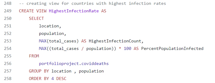
- Query that examined the countries with the highest infection rate relative to their population
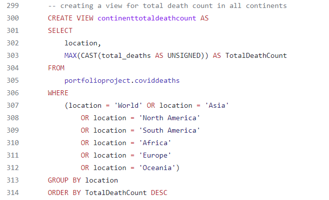
- Query that showed each of the continent’s total death count, including the world total
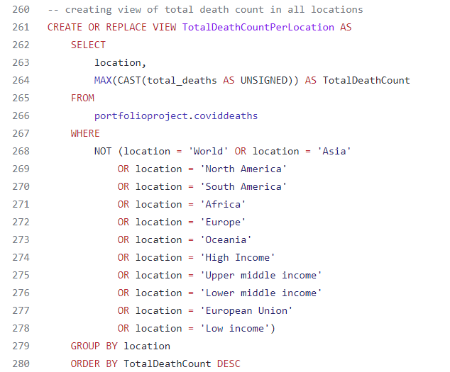
- Query that showed each of the country’s total death count
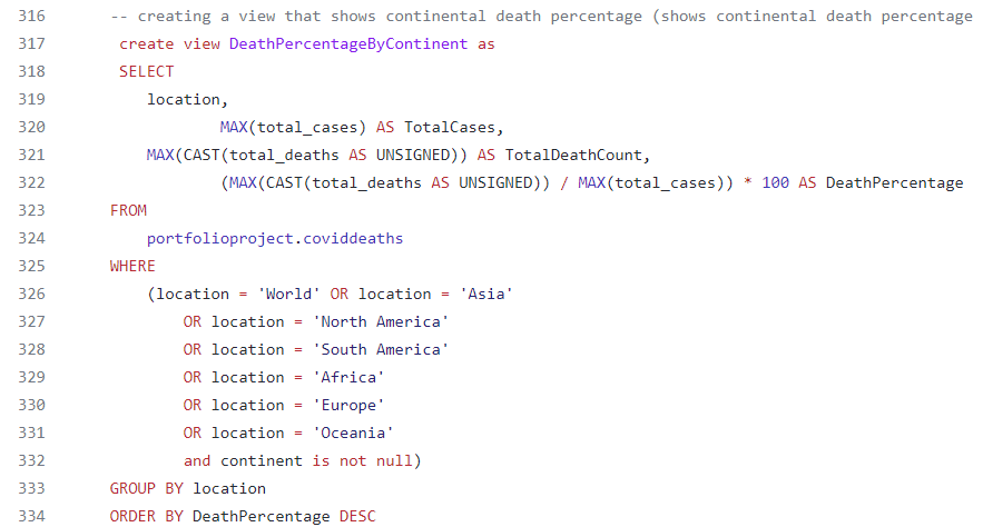
- Query that showed each continent’s death percentage based off their total death count divided by total continental cases
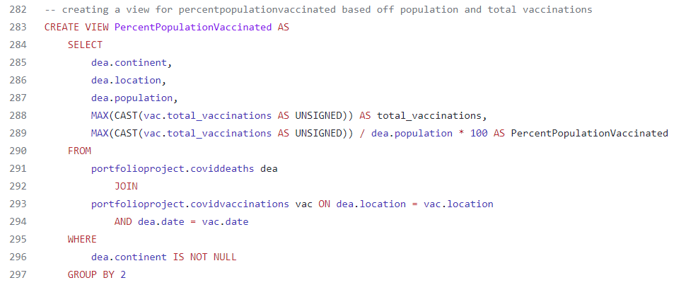
Following my examination of the data regarding Covid-19 deaths, I then wanted to analyze the Covid-19 vaccination data I had, of which I joined the two tables together. After joining the two tables together in MySQL, I wanted to study the percentage of each country’s population that has been vaccinated by looking at the total population versus total vaccination count.

Data Visualization
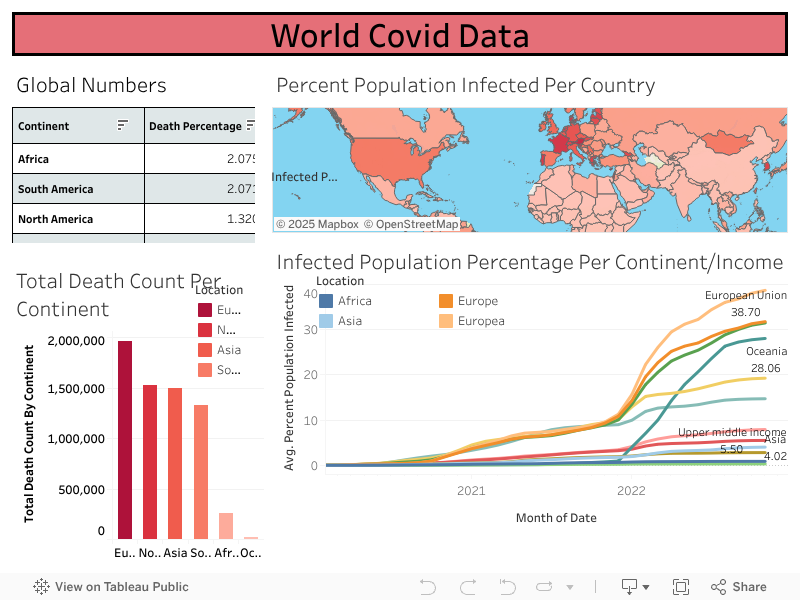
Finally, after manipulating and examining my data through MySQL, I was able to move on to visualizing my data and telling its story to the world. To help do this, I used Tableau and created an interactive dashboard from several "views" I had made with MySQL queries. Below are the several "views" that I used to help create my Tableau dashboard, as well as the dashboard itself.
The Results
With all of the data exploration and visualization complete, it was time to analyze the results of my project. While studying the data, it was interesting to compare the global numbers between all of the continents and find that Europe has the most total cases of Covid-19 and the highest total death count. Using the ‘Infected Population Percentage Per Continent/Income’ chart I created, it was fascinating to see that the European Union and the rest of Europe also had the highest percentage of infected people per their population. This could be a result of the close proximity among countries in the European continent as well as a factor of when their borders began to close. More interestingly, North America as a continent is third in total cases with close to 80 million cases less than Asia, but is second in total death count!
Focusing on each country, the top ten countries with the highest infection percentage per population were:
- Cyprus - 67.26%
- Faroe Islands - 65.25%
- San Marino - 64.30%
- Gibraltar - 61.58%
- Austria - 61.06%
- Andorra - 58.35%
- Slovenia - 58.34%
- Denmark - 56.74%
- Iceland - 55.40%
- Saint Pierre and Miquelon - 54.90%
- © Untitled
- Design: HTML5 UP